Photoshop Tutorial: Creating a Composite Photo
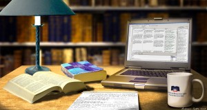
I once had a video production project that featured the work of Bible translators coming together for a conference. It was anticipated that there would be future productions on the same subject and a sense of branding to tie them all together would be useful. To accomplish this, I decided to create a show opener animation and a package of lower 3rds and backgrounds that could be reused in future videos.
This image is the base of a short animation that opens the video. Its purpose was to capture the feeling of the work of native language translators, to show a connection between ancient texts and modern technology, and to work some organizational branding into the mix (the logo on the coffee mug and the Bible cover.)
What follows is a step-by-step breakdown of how I created this image. There’s nothing earth shattering about the techniques used, but hopefully seeing my approach and process will give you a few ideas that may help you on a future project.
Step 1: Photographing Visual Elements

When I started this project I had a rough idea of how I wanted the final image to look. I didn’t feel like I needed to sketch it out so I jumped right in photographing the visual elements I would need to assemble my final composite. From the picture above you can tell that I shot the source photos from an angle that was as close to the final position as possible. I kept the camera at the same height for each picture so the perspectives would not need significant adjusting.
Each image was shot with available overhead light and no flash. (The image of the lamp at the end is from a stock collection and required the most fixing to get it to blend in properly.)
I opened up each photo in Photoshop and used the pen tool to create a mask for each object to separate it from the background.
Step 2: Finding Textures in my Archives

Next I dug through my personal stock image collection to find some images for my background and a texture to use as my desktop (whenever I see interesting textures and objects I like to photograph them for future use.) The book images where shot on a previous project I had done and the wood texture was from another project as well.
Step 3: Positioning the Primary Elements of the Design
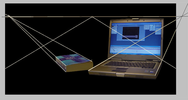
With all of the source material gathered, the first step was to create a new Photoshop document and begin the layout process. I kept my work area at a high resolution (3747×2000) because I new I would be using After Effects later to animate this image and make my final video. I wanted plenty of room for panning and zooming around.
The first image placed in the composition was the laptop. It was used to anchor the composition and establish the horizon line. I created a new layer and drew lines along 2 parallel edges of the laptop. The point were they intersected established the horizon, and I dragged a guide there for reference.
Using this guide, I placed the closed Bible next to the laptop. By tracing the parallel lines from this book to the horizon and using the distort tool make adjustments to the book, I was able to match the perspective of the book to the baseline established by the laptop.
The lines converging in the center of the picture establish the edges of the desk that will be created in a few more steps.
Step 4: Placing the Remaining Objects in the Scene
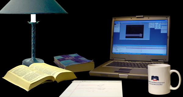
Using the same process in step 3 above, I place the remaining items in the picture. The lamp was the most difficult adjustment because it was not photographed in a similar perspective to the rest of the objects. I had to select the base and distort it separately from the rest of the image, but with a little work it came out fine.
At this point I have a nice composition of the major foreground elements. Next it is time to begin building the environment around them.
Step 5: Establishing the Desk Top

Next, I hid the layers containing the foreground objects.
Using the perspective lines I created a few steps back, I created a new layer underneath the foreground objects and outlined a shape for the desk using the selection tool. This shape was filled it with a brown color.
It doesn’t look like much, yet, but it is in the correct perspective.
Step 6: Texturing the Desk Top
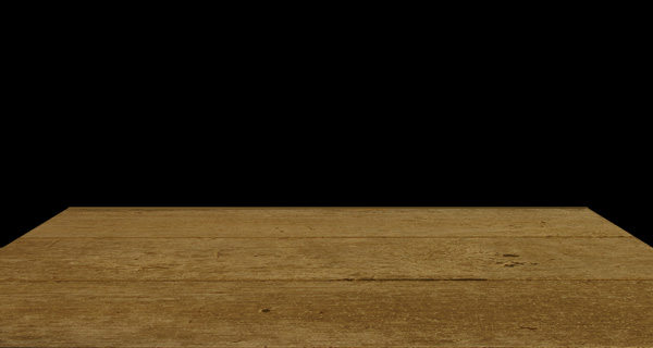
I created a new layer with the wood texture picture on it. I selected the texture, and distorted it by dragging the corners to match up with the corners of the table top.
Next I changed the transfer mode for the texture layer to ‘Soft Light’ and the result is a nicely textured wooden table top.
Step 7: Building the Background
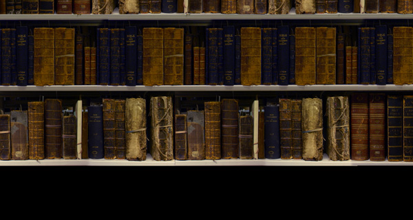
I imagined this scene taking place in a library filled with old Bibles. To create this effect I made a new background layer and began pasting together copies of the bookshelf images. Ultimately I had 3 layers (one for each shelf) that I flattened together to make the final background.
The image shows pretty clearly that there is a repeating pattern of books, but I was not too worried because this would all be out of focus and the foreground images would block much of it. The final video version would also show a smaller section of the total picture which would further hide the repetition.
If this were strictly a still image, I would have spent more time mixing up the books and changing their colors to further hide the repetition. But, since it would be a motion graphic, the viewing time would be brief and the moving elements would distract the eye.
Step 8: Throwing the Background Out of Focus

Photoshop CS has a new blur effect included that does a great job simulating a true camera blur. It is a subtle detail to give the picture a more convincing look.
Step 9: Viewing All the Elements Together

Here’s the foreground and background all combined together. All of the perspective angles are lining up well and the table texture and background are creating the warm setting I wanted.
Now it is time to start tying everything together with highlights and shadows.
Step 10: Anchoring with Shadows
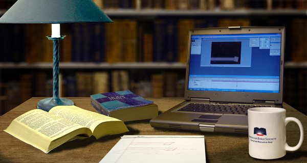
I created 2 new layers underneath the foreground elements. The first creates the oval shadow on the tabletop which defines the edge of the light coming from the lamp. I used the oval selection tool and the freehand selection tool to isolate just the edges of the table. This was filled with black. I deselected the layer, ran a gasussian blur over it to soften the edges, changed the transfer mode to ‘Multiply’ and reduced the opacity to 46%.
Next, on the second shadow layer, I used the airbrush to paint shadows under the edges of each object. This helps to anchor them to the desktop. This layer also has its transfer mode set to ‘Multiply’ and its opacity set to 80%.
All of the objects seem to be well anchored in their environment now and the overall lighting for the scene is starting to come together.
Step 11: Swapping Out the Computer Screen and Tablet
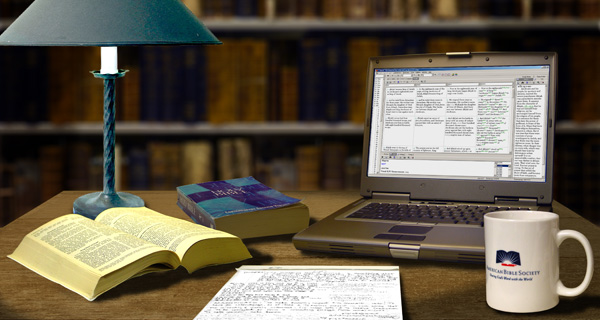
The screen image and writing tablet text needed to be changed, so I created a new layer for each and pasted the new image in. I selected each layer and used the distortion transformation to fit them over the old images.
The images is looking good now, but it needs a little more work.
Step 12: Refining the Shadows
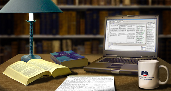
I created several new layers of shadows and used the freehand airbrush to add some extra modeling to the mug and to create a shadow on the edge of the paper tablet. These layers were all set to a ‘Multiply’ transfer mode and their opacities were adjusted until they looked good.
At this point I also added a glow to the open book and computer screens by adding 2 new layers with their transfer modes set to ‘Screen’ and using the airbrush to paint white highlights. I adjusted the opacity of each layer until I had a nice subtle effect.
Step 13: Finishing Touches
The final step to complete the image was to create a highlight layer in the shape of the light cone coming from the lamp, and place it on top of everything except the lamp. I used the selection tool to create the shape, filled it with white and then applied a heavy Guassian Blur to soften the edges. I set the transfer mode to ‘Screen’ and left the opacity at 100%.
This made the image pop. At this point I called the composite ‘done’ and here is what it looked like:

The next step in the project was import the layered Photoshop image into After Effects and position the layers into 3D space. The bookshelf was placed on the Background Layer and everything else was placed on a foreground layer.
I animated the camera to move across the image and then pull back slightly. It was a subtle camera move, but it added just the right amount of ‘life’ and depth to the scene.
The finishing touch was a bit of steam coming out of the coffee mug.
This little detail added realism, but more importantly, it draws the viewer’s eye toward the logo.